Why We Rebuilt the Kaizen Website
See the site as it works today. Explore real projects, use the speed check and find out what happens when you get in touch.

This article was first published in November 2025. We reviewed it in October 2026 to describe the site you can use now.
Our website needs to help an owner decide whether to talk to us. Here are the parts you can explore before that conversation.
The home page shows the work behind the offer.
The Kaizen home page starts with web design for businesses. It shows examples of the work, with a clear path to the details.
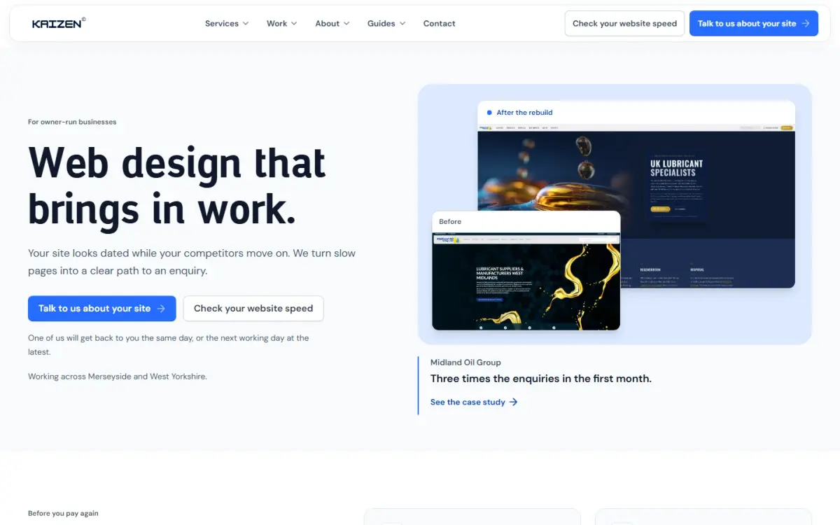
The home page as shown in October 2026. The examples link to our work, so you can look beyond the first screen.
The Midland Oil case study shows the old and new pages side by side. You can see how product choices changed and what happened after launch.
We also describe the Helen Moore salon website. These projects give you something concrete to compare with your own needs.
The speed check gives you a place to start.
You can check a page's speed without arranging a call. The tool runs a simulated phone test and shows your score first.
If the score is below 90, we ask for your email to see the full report. You can then download a PDF in your browser.
The report points to things worth checking. It does not measure lost enquiries or promise a place in search results.
Our guide to reading the report explains those limits and what to try next.
The guides answer questions before you commit.
The website guides cover choosing a designer, costs and common faults. Each has a separate job, so you can go straight to your question.
The cost guide helps you compare quotes. The common-mistakes guide gives you checks to try on your own site.
We can update the pages and articles as the advice changes. The date on each reviewed guide records when its content was checked.
Getting in touch has a clear next step.
Our contact page explains the first conversation and how soon we reply. The form asks for the details we need to start it.
On a phone, the name fields sit on separate lines. Their labels remain visible as you type.
The W3C guide to form labels explains why those labels help people understand what to enter. That is one practical detail you can check on your own site too.
The first conversation is free. Work starts after a non-refundable deposit, once the scope is agreed.
What matters is whether the site helps you choose.
You can inspect the work and try the speed check today. You can also read our pledge before deciding whether to get in touch.
We have not measured an enquiry increase from these latest changes. Clearer pages are a change we can show; business results need their own evidence.
One of us will get back to you the same day, or the next working day at the latest.