5 Website Mistakes You Can Check on Your Own Site
Check your site on a phone. Follow the path to an enquiry and check what gets in the way.

Start by opening your website on a phone. Find the service you sell, then try to contact the business.
Write down anything that makes that journey hard. These five checks give you a place to start.
1. The first screen hides what you do.
A visitor should be able to name your service without searching. Put what you do and who you help near the top.
Read just the headings on the page. They should explain the offer and the next step on their own.
Headings also help people who use a screen reader find their way. The W3C guide to headings explains how they organise a page.
Try the page with someone who does not know your business. Ask what they think you offer. Use any confusion to decide what needs clearer words.
2. Large images make people wait.
Open an important page using your phone's mobile connection. Check how soon the main text, photo and contact link appear.
Large picture files can add to the wait. Ask whoever looks after your site to check image sizes and when they load.
Google's guide to image loading explains why pictures lower down can wait until you scroll. Pictures at the top need different treatment.
Our free website speed check can help you find a starting point. It cannot tell you how many enquiries a delay has cost.
3. The next step is hard to find.
Choose the main action for each page. It might be asking for a quote, booking a visit or making a call.
Use words that say what happens when someone clicks. Keep the label consistent when buttons do the same job.
Also say what happens after the person gets in touch. Give a reply time you can keep and explain any first step.
On Kaizen's site, the main action leads to a website conversation. The first chat is free. Work starts after a non-refundable deposit.
4. The form is awkward on a phone.
Fill in your own form on a phone. Check that each box has a clear label and that the text is easy to read.
Our contact form puts the name fields on separate lines on phones. Their labels stay visible above each box.
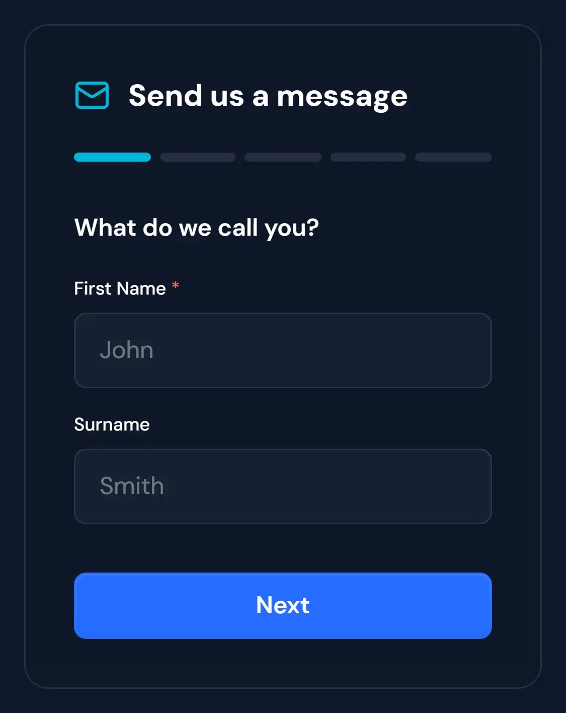
This screenshot shows the first step of our form. The grey names are example text, not a real person's details.
The W3C guide to form labels explains how labels help people understand each field. They also need to work with tools that read the page aloud.
Try correcting an error, then send a clearly marked test enquiry. Check that it reaches the right place. A success message on the page is only one part of that check.
5. Old details go unchecked.
Check the services, opening hours and areas you show. Remove offers you no longer provide. Make sure the phone number and email still reach you.
Open your key links and look for missing pages. If you serve local customers, use our local-search checklist to check your business details.
Repeat these checks when your services change and after website updates. Ask who handles edits and how to report a fault.
Our web design work shows how we help businesses improve their sites. You can also see real website rebuilds before deciding what yours needs.
One of us will get back to you the same day, or the next working day at the latest.